REVITALIZATION
The energy company NATIONAL GRID first came to Hill & Partners in 2011. Many of their prime office spaces were not reflecting their current brand identity and were not functional for their new ways of working.
At this time the marketing in their commercial areas focused primarily on National Grid as a powerful utility company and how to best show their company size. Through site visits and several rounds of conceptual designs, Hill & Partners created the plan to transform from neutral office spaces into Brand Environments.

For instant recognition, we placed a large aluminum faced 3D logo visible from the hallway elevators among a contrasting blue and gray palette with current environmental imagery from four NATIONAL GRID jurisdictions.
next
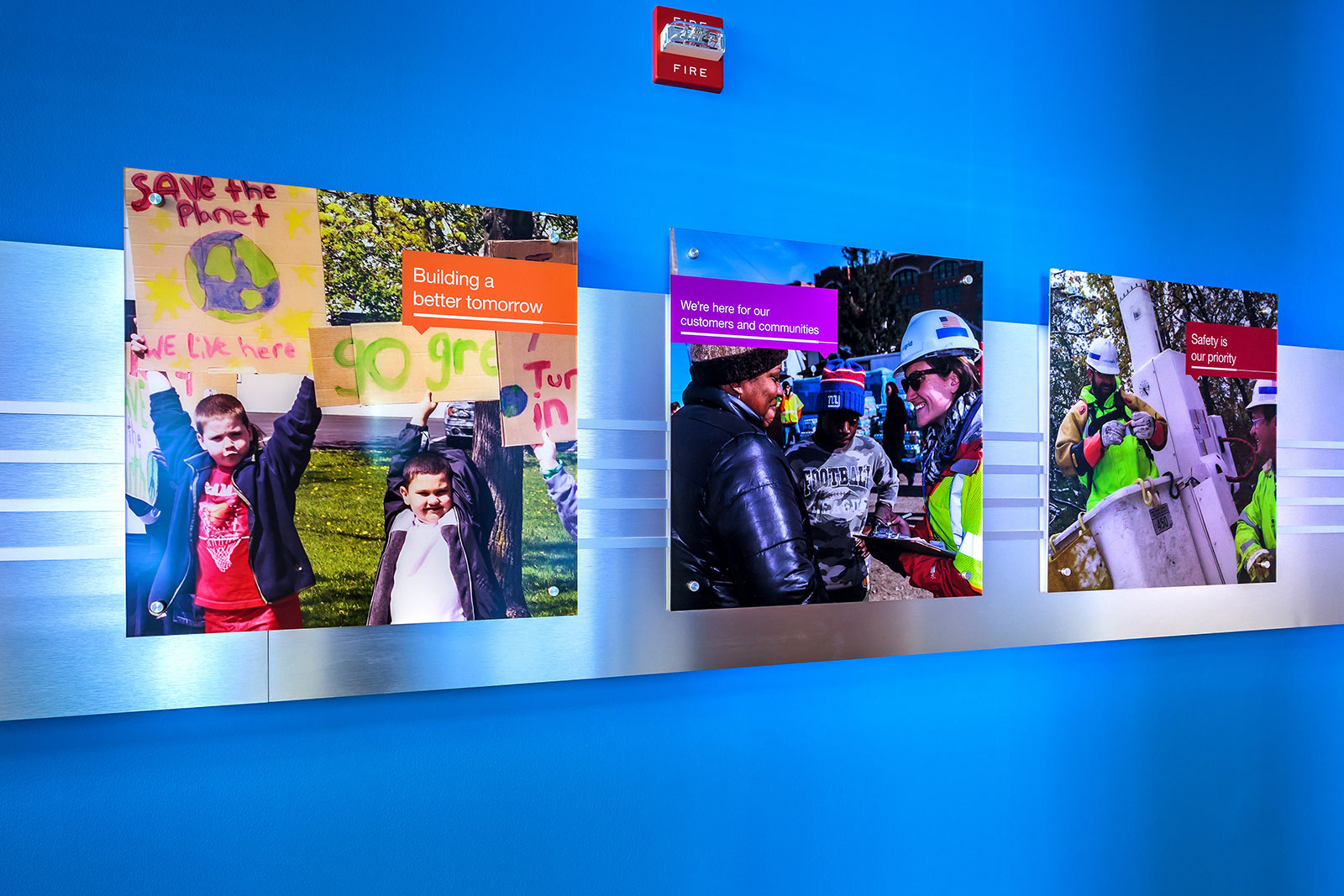
To create a more vibrant & energetic workplace, we used bright colors & local community based photography that highlighted the people that make NATIONAL GRID a world-class company.
next
To reflect the company history we chose changeable wall mounted graphic signage for the main conference room that showcased the company's legacy partners and early beginnings.
next
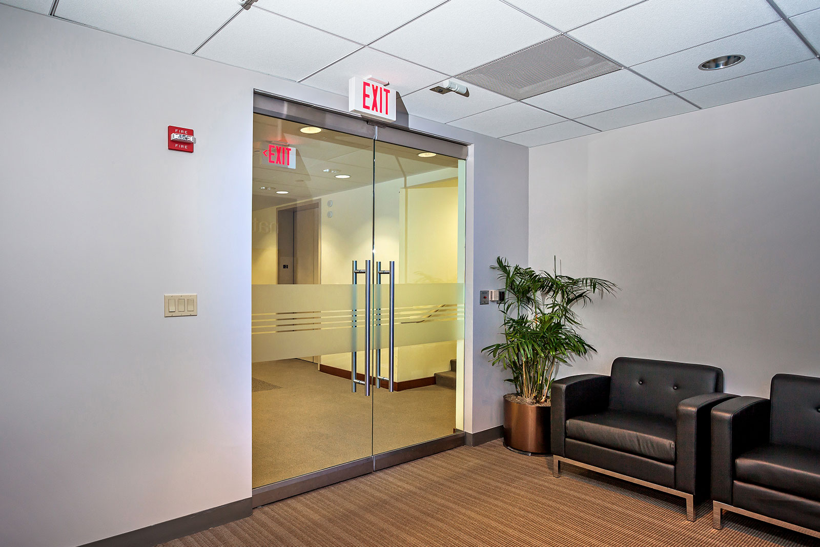
To complete the environment, we applied their iconic cable & wires detail in frosted vinyl to the glass doorways that populate the office.
next
